

Transformative Data Visualization Techniques for Informatics Restructuring Strategies
In today’s data-driven world, the ability to translate complex information into understandable formats is crucial. Transformative data visualization techniques play a pivotal role in informatics restructuring strategies, empowering organizations to make informed decisions, improve operational efficiency, and enhance communication. This article delves into current developments, emerging trends, and practical applications of these techniques, providing valuable insights for professionals in the field.
Understanding Transformative Data Visualization
Transformative data visualization refers to the process of creating graphical representations of data that not only convey information but also enhance understanding and foster insights. By utilizing advanced visualization tools and methodologies, organizations can uncover patterns, trends, and correlations that might otherwise remain hidden in raw data.
Key Techniques in Data Visualization
-
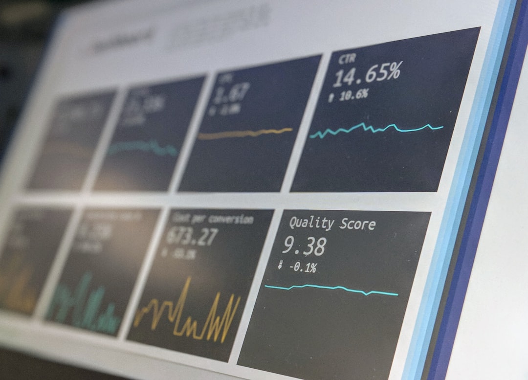
Interactive Dashboards
Interactive dashboards allow users to engage with data in real-time. By incorporating filters, sliders, and drill-down capabilities, dashboards enable stakeholders to explore various dimensions of data without needing extensive technical expertise. Tools like Tableau and Power BI have made it easier for organizations to implement these solutions. -
Geospatial Visualization
Geographic Information Systems (GIS) and mapping tools are transforming how data is visualized. By overlaying data on maps, organizations can analyze spatial relationships and identify trends related to geography. For instance, healthcare organizations can visualize disease outbreaks within specific regions, aiding in resource allocation. -
Data Storytelling
Data storytelling combines data visualization with narrative techniques to create compelling stories. This approach is particularly effective in presentations and reports, allowing stakeholders to connect emotionally with the data. The use of infographics, animations, and interactive elements can significantly enhance the storytelling process. -
Augmented and Virtual Reality
With the rise of augmented reality (AR) and virtual reality (VR), data visualization is entering a new dimension. These technologies allow users to immerse themselves in complex datasets, providing a more intuitive understanding of the information. Industries such as construction and manufacturing are beginning to leverage AR and VR for project planning and execution.
Current Developments and Trends
The landscape of data visualization is rapidly evolving, driven by advancements in technology and changing user needs. Some notable trends include:
AI-Powered Visualization
Artificial Intelligence (AI) is streamlining data visualization processes by automating tasks such as data cleaning and summarization. AI-driven tools can analyze vast amounts of data and generate visualizations that highlight significant trends and anomalies, drastically reducing the time required for manual analysis.
Real-Time Data Visualization
As organizations demand instantaneous insights, the need for real-time data visualization has surged. Technologies that facilitate real-time data streaming and visualization are becoming essential, particularly in sectors like finance and e-commerce, where timely decision-making is critical.
Enhanced Accessibility
Efforts to make data visualization more accessible for individuals with disabilities are gaining traction. Implementing features such as screen reader compatibility and color-blind friendly palettes ensures that data insights are available to a wider audience, fostering inclusivity in data interpretation.
Practical Applications and Case Studies
One striking example of transformative data visualization in action is the use of heat maps in urban planning. Cities utilize heat maps to visualize traffic patterns, population density, and public service usage. These visualizations inform infrastructure development and resource allocation, ultimately improving urban living conditions.
In the healthcare sector, a hospital implemented an interactive dashboard to monitor patient flow. By visualizing admission rates, staff availability, and equipment usage, the hospital optimized its operations, reduced patient wait times, and improved overall care.
Expert Opinions
According to data visualization expert Edward Tufte, “Good design is a lot like clear thinking made visual.” This quote emphasizes the importance of clarity in data visualization, underscoring that the ultimate goal is to enhance comprehension and drive action.
Further Reading and Resources
For those interested in expanding their knowledge of data visualization, consider the following resources:
- The Visual Display of Quantitative Information by Edward Tufte
- Data Visualization: A Practical Introduction by Kieran Healy
- Tableau Public – A free platform to create and share data visualizations.
Incorporating these transformative data visualization techniques into informatics restructuring strategies can significantly enhance decision-making processes and operational efficiency. As the field continues to evolve, staying informed and adapting to new tools and methodologies will be crucial for success.
By mastering these techniques, you can lead your organization towards more insightful decision-making and improved communication. Consider exploring the tools mentioned above and engage with the data to unlock its full potential. If you found this article insightful, feel free to share it with your network and subscribe for more updates on technology trends and innovations.