

Building a Strong Community with Graphs and Data Visualization
In today’s digital age, the importance of building a strong community cannot be overstated. Whether it’s for a business, a non-profit organization, or an online platform, fostering a supportive and engaged community is vital for success. One of the most effective ways to achieve this is through the use of graphs and data visualization. This article explores how leveraging these tools can strengthen community ties, enhance communication, and drive engagement.
The Power of Data Visualization
Graphs and data visualization serve as powerful tools to communicate complex information in a digestible format. In a community setting, they can help members understand key metrics, trends, and patterns. By presenting data visually, you can highlight achievements, track progress, and identify areas for improvement.
For instance, a non-profit organization tracking the number of meals distributed over time can use line graphs to showcase their growth trajectory. This not only informs the community about the impact of their contributions but also motivates members to continue their support.
Enhancing Communication
Effective communication is at the heart of any strong community. Data visualization tools can facilitate clearer and more compelling communication among members. By creating interactive dashboards, communities can share important updates, milestones, and upcoming events in an engaging manner.
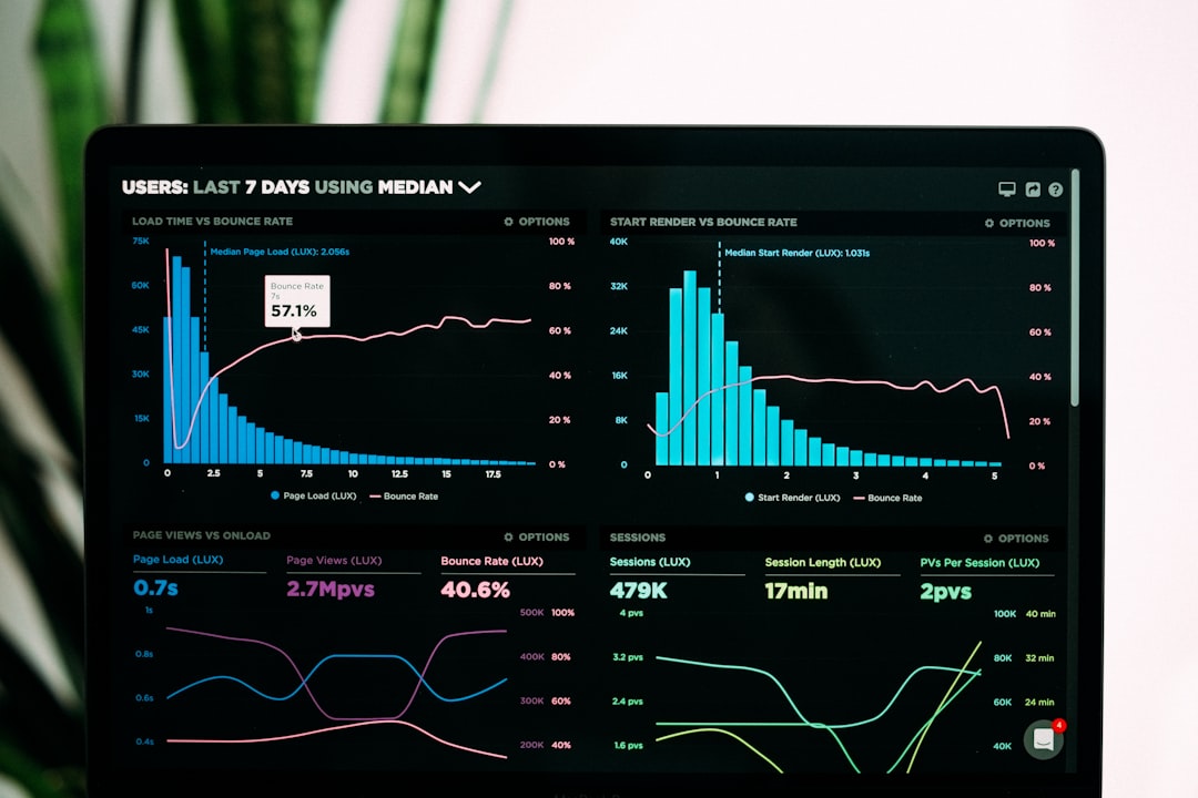
Consider using platforms like Tableau or Google Data Studio to create visual dashboards that showcase community metrics. These tools allow members to explore data interactively, encouraging participation and fostering a sense of ownership. For example, a local sports team could display player statistics and game schedules, inviting fan engagement through comments and discussions.
Identifying Community Needs
Understanding the needs of your community is crucial for growth and development. Through surveys and feedback forms, you can gather data that highlights what members value most. By visualizing this data, you can identify common themes and areas that require attention.
Using pie charts or bar graphs, you can present the results of surveys that ask community members about their interests, preferences, and concerns. This information can shape future initiatives and ensure that the community evolves in line with its members’ needs.
Engaging Through Storytelling
Graphs and data visualization are not just about presenting numbers; they are about telling a story. When you use data to narrate a journey or highlight achievements, it creates a more relatable and emotional connection with the community.
For example, by showcasing a timeline of milestones achieved, such as fundraising goals met or community events held, you can evoke a sense of pride among members. Incorporating visuals like infographics can further enhance this storytelling aspect, making the information memorable and shareable.
Case Studies: Successful Community Engagement
Several organizations have successfully utilized graphs and data visualization to strengthen their communities.
Example 1: Local Environmental Group
A local environmental group used data visualization to track their community’s recycling efforts. By creating a dashboard that displayed real-time statistics on recycling rates, they encouraged community members to participate in clean-up events. The visual representation of their impact motivated members to stay engaged, leading to a 30% increase in participation over a year.
Example 2: Online Learning Platform
An online learning platform implemented data visualization to showcase student progress across courses. By using graphs to display completion rates and skill mastery, students could see their achievements in a tangible way. This transparency fostered a supportive learning environment, where students shared tips and resources, leading to a thriving online community.
Tools for Data Visualization
To embark on your journey of building a strong community through graphs and data visualization, consider the following tools:
- Tableau: A leading data visualization tool that allows for interactive dashboards.
- Google Data Studio: A free tool that integrates with various data sources, perfect for creating reports.
- Infogram: User-friendly software for creating infographics and data visualizations.
For more resources, check out Data Visualization Society for insights and best practices.
Conclusion
Building a strong community requires effective communication, understanding of needs, and engagement. Graphs and data visualization play a pivotal role in achieving these goals. By transforming data into meaningful visuals, you can foster a sense of belonging and collective achievement within your community.
Remember to encourage your community members to share their thoughts and insights. This not only enhances engagement but also promotes a culture of collaboration and support. As you incorporate data visualization into your community-building strategy, you will likely see increased participation, motivation, and a stronger sense of community.
To stay updated with more insights on technology trends and innovation in community building, consider subscribing to our newsletter or sharing this article with others who might find it valuable.